Ecu Studio
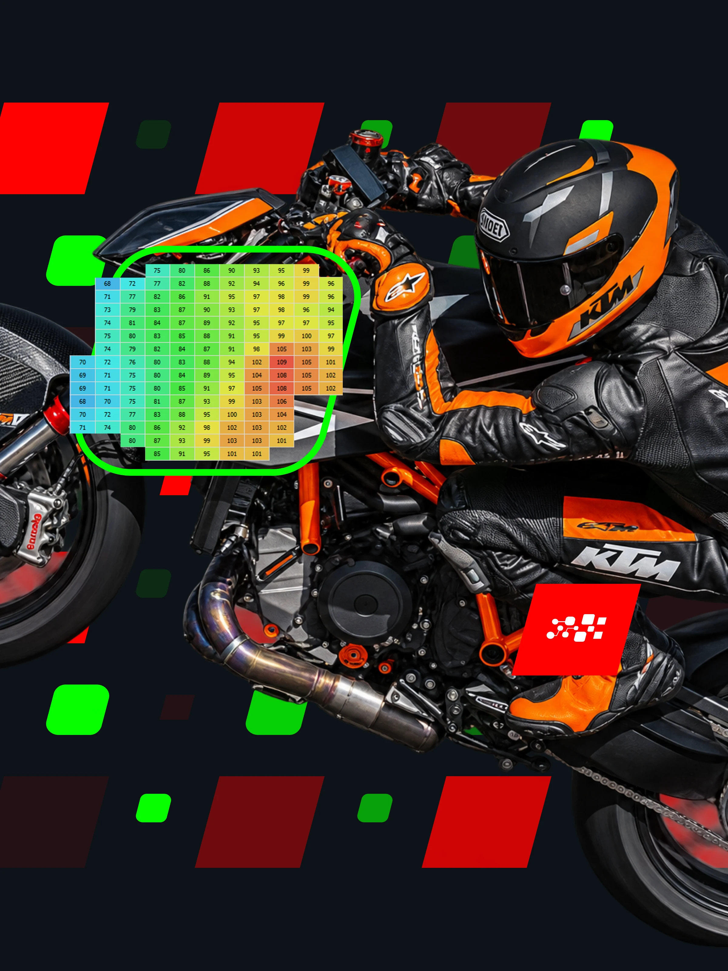
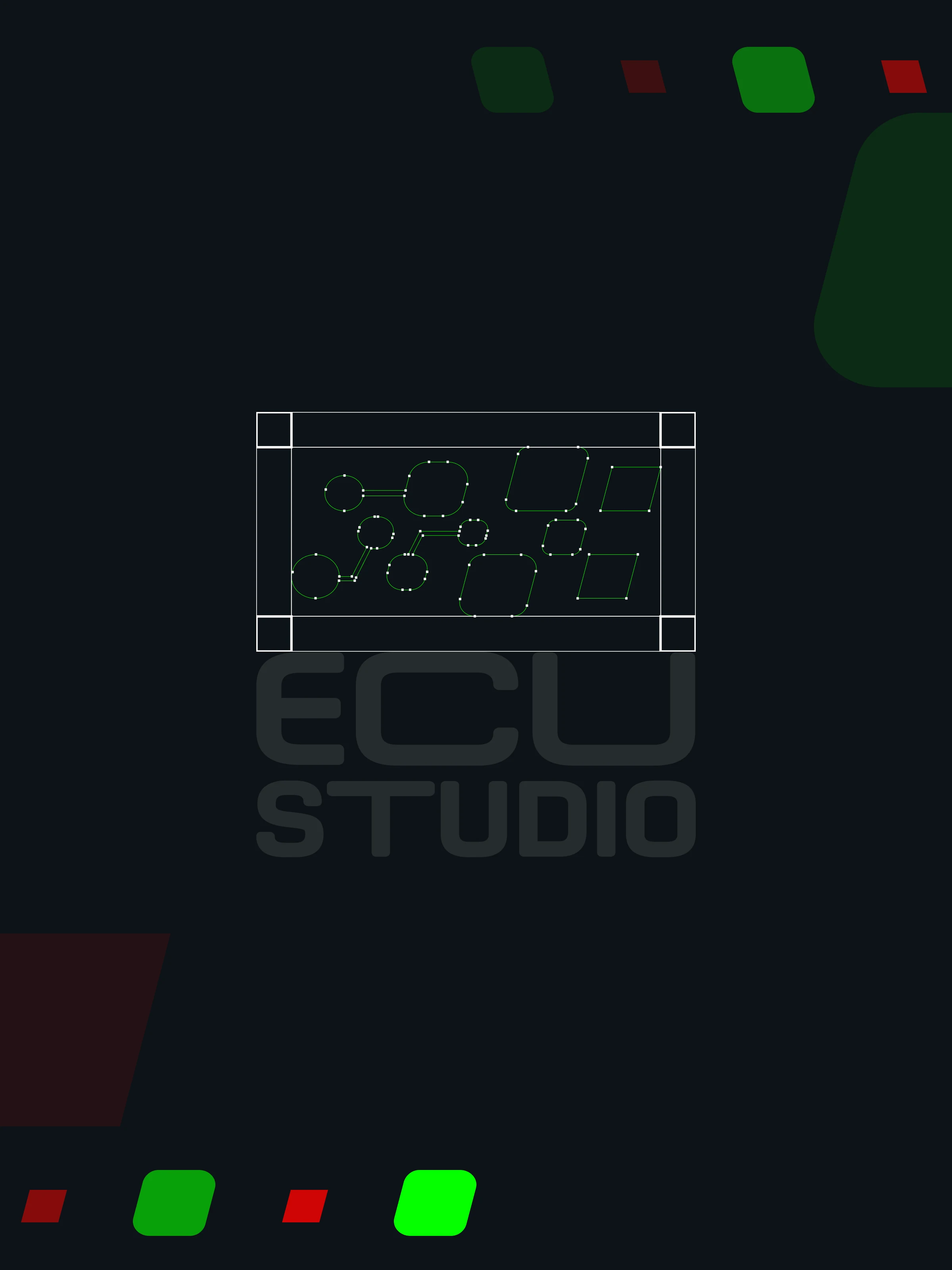
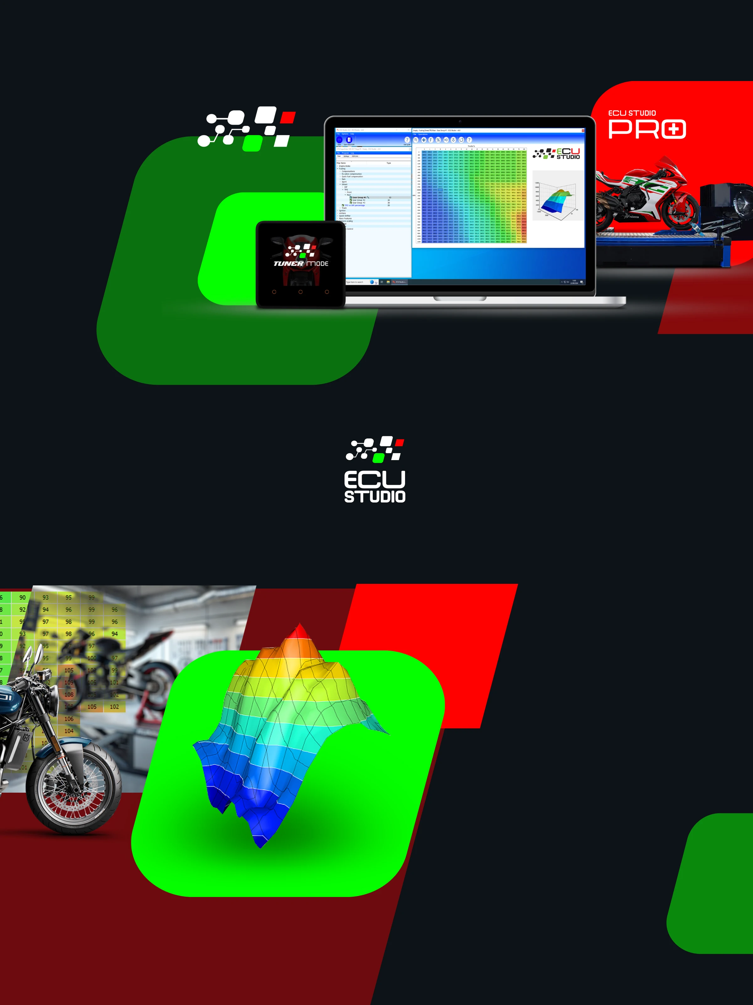
Full rebrand, ESWICAN interface redesign, unified product family identity, and user documentation for software and hardware.
The challenge
A demanding user base spanning professional tuners who live inside these interfaces all day and enthusiasts who are technically capable but not specialists. Designing across that spectrum — without dumbing down for one or alienating the other — requires a specific precision. The visual language cannot be warm and approachable the way a consumer app might be. It has to communicate competence and control.
Three products needed to feel coherently related while each keeping its own functional identity. A system that collapsed the differences would confuse users navigating between products; one that exaggerated them would break the brand.
The insight
Technical audiences don't distrust good design — they distrust design that gets in the way.
Visual precision and functional clarity are the same thing when users work at the level of engine parameters and tuning protocols. A cluttered interface isn't an aesthetic failure, it's a professional one. Design that communicates control and reliability is part of the product's value proposition.
The approach
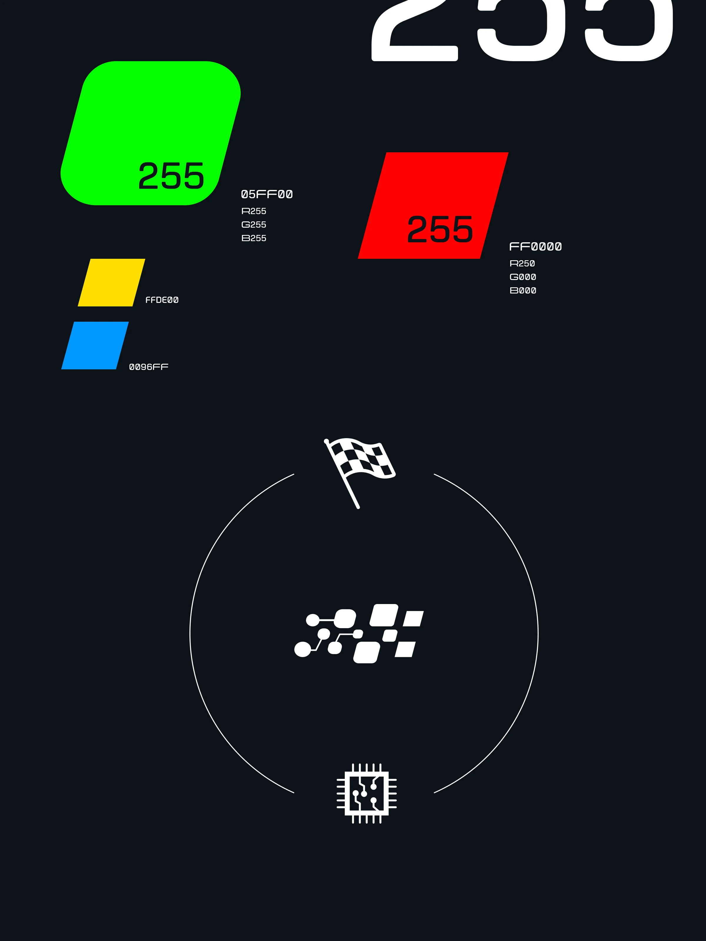
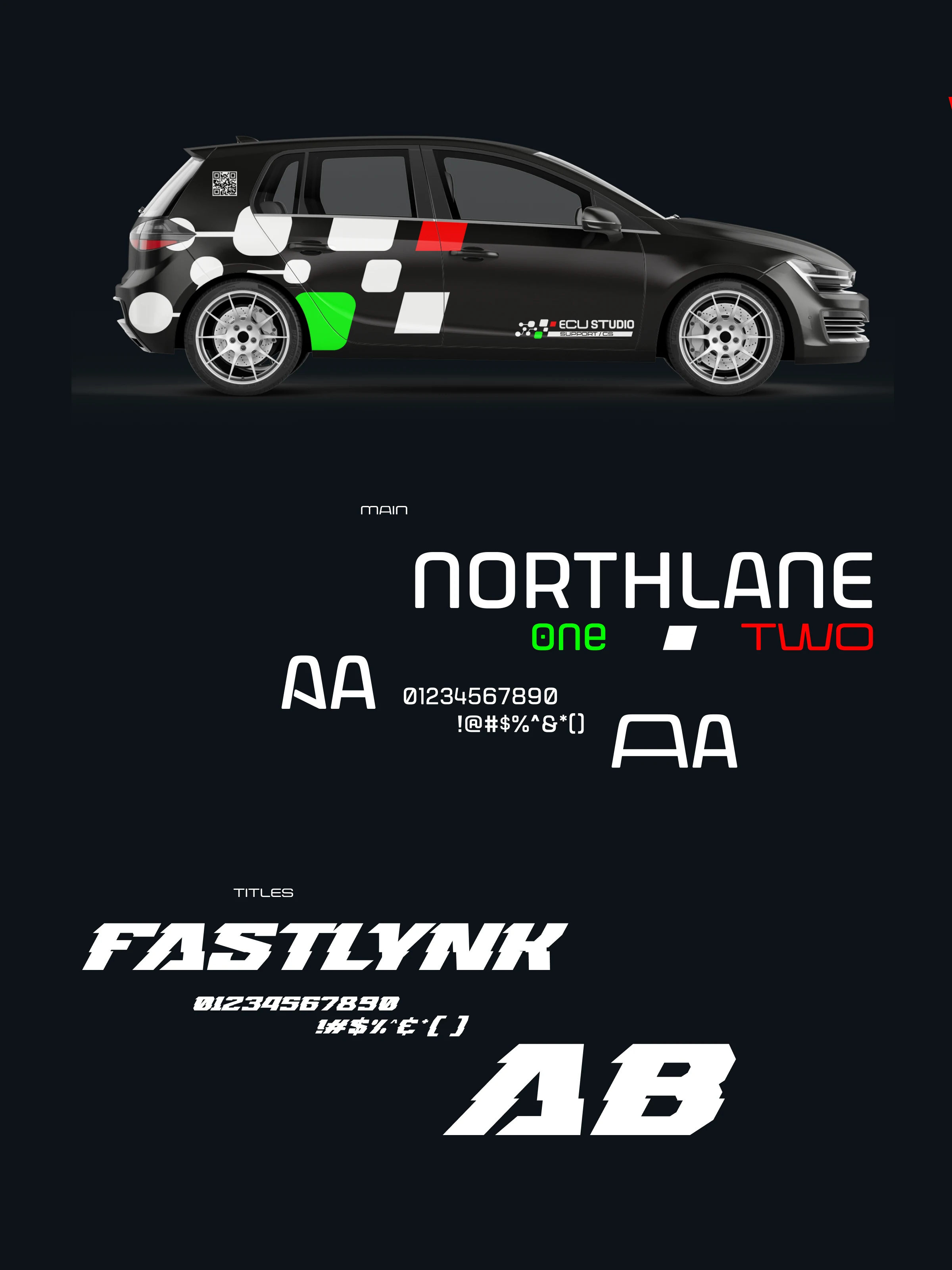
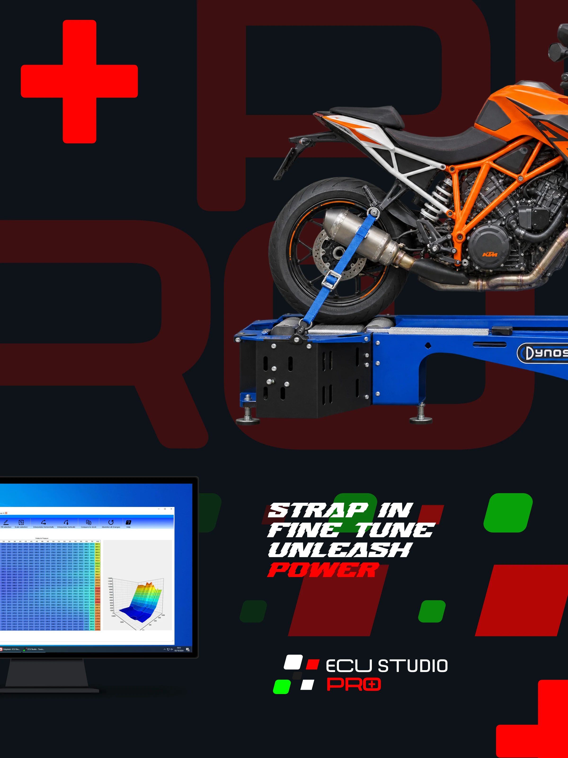
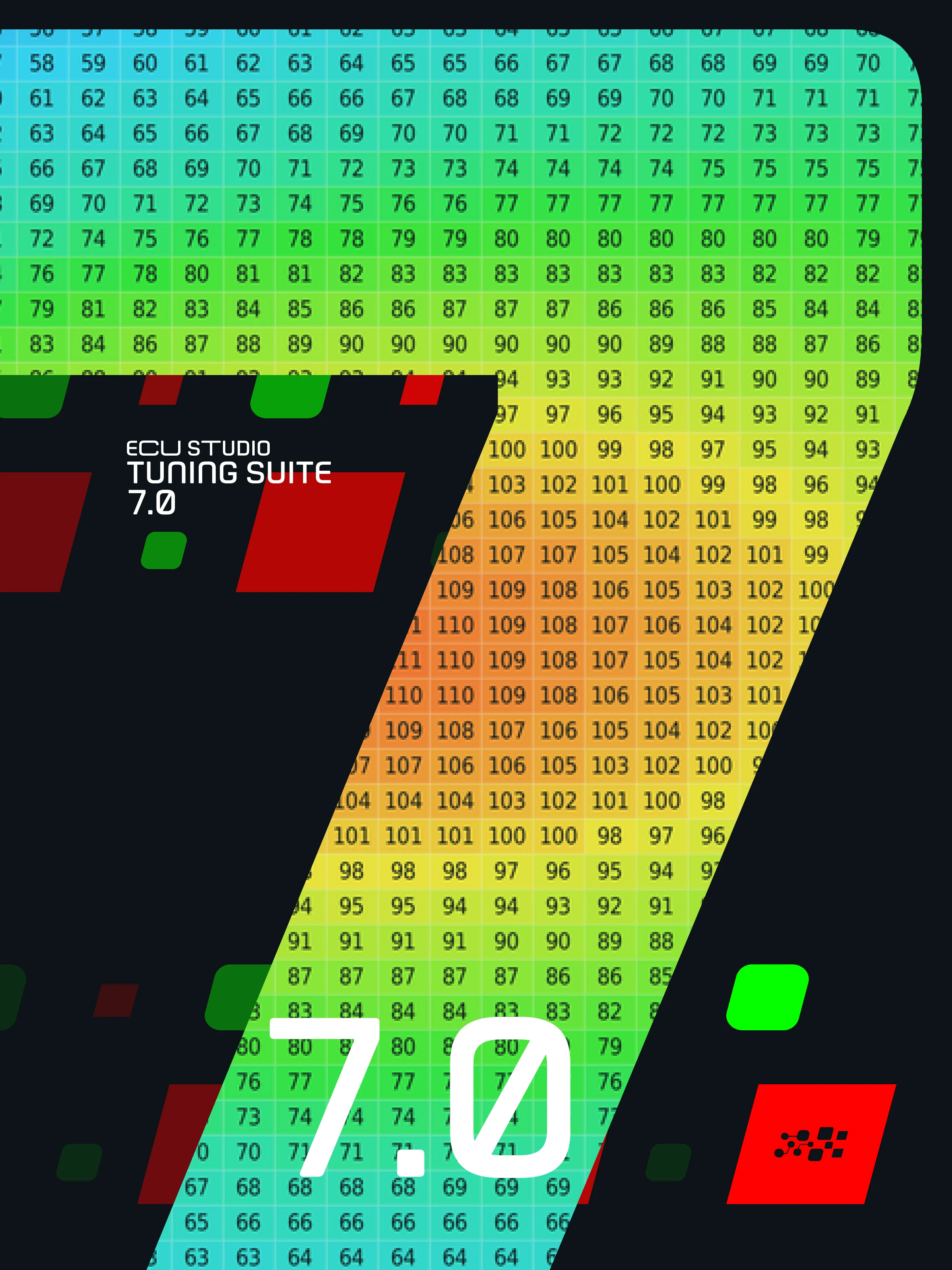
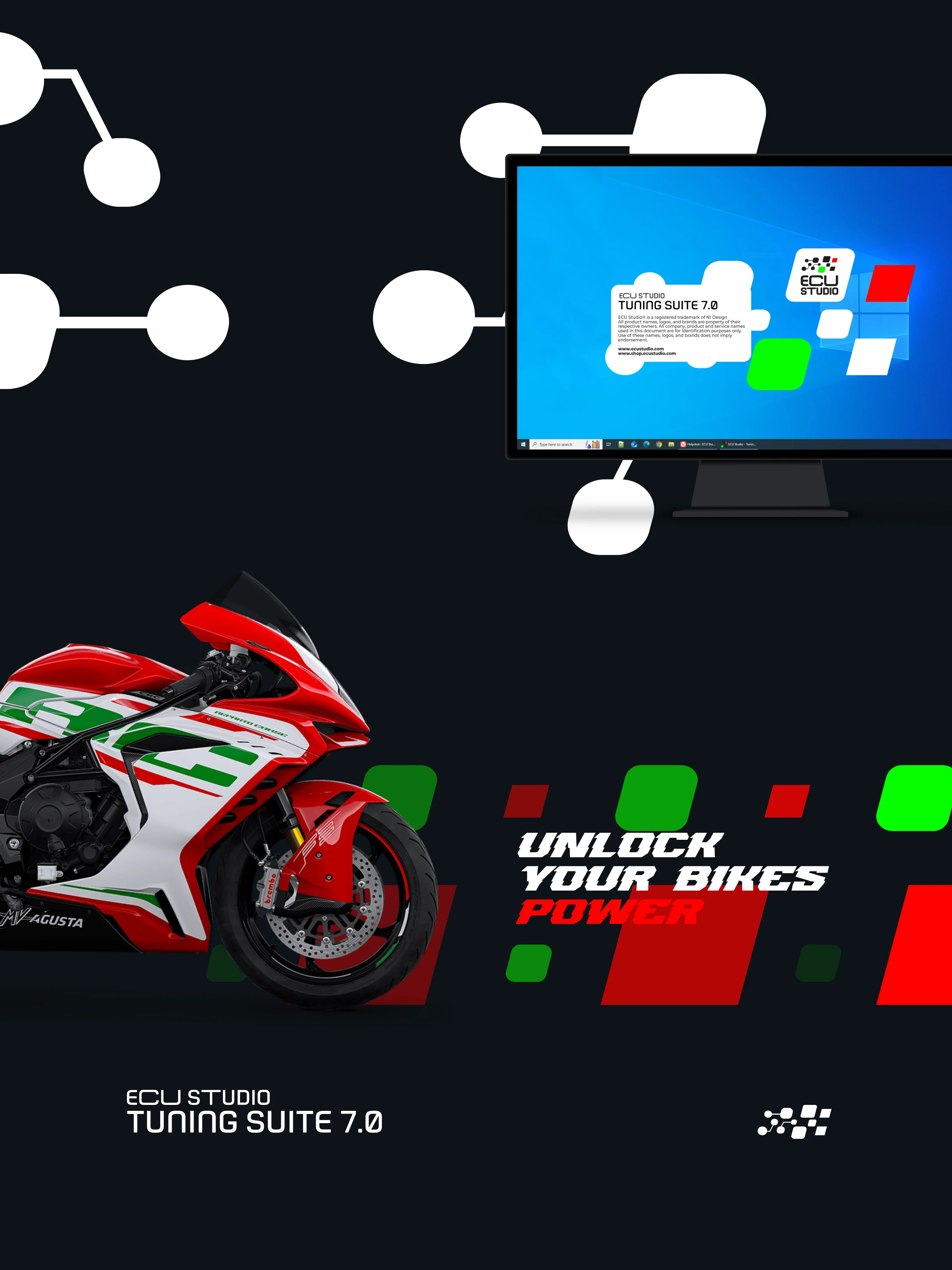
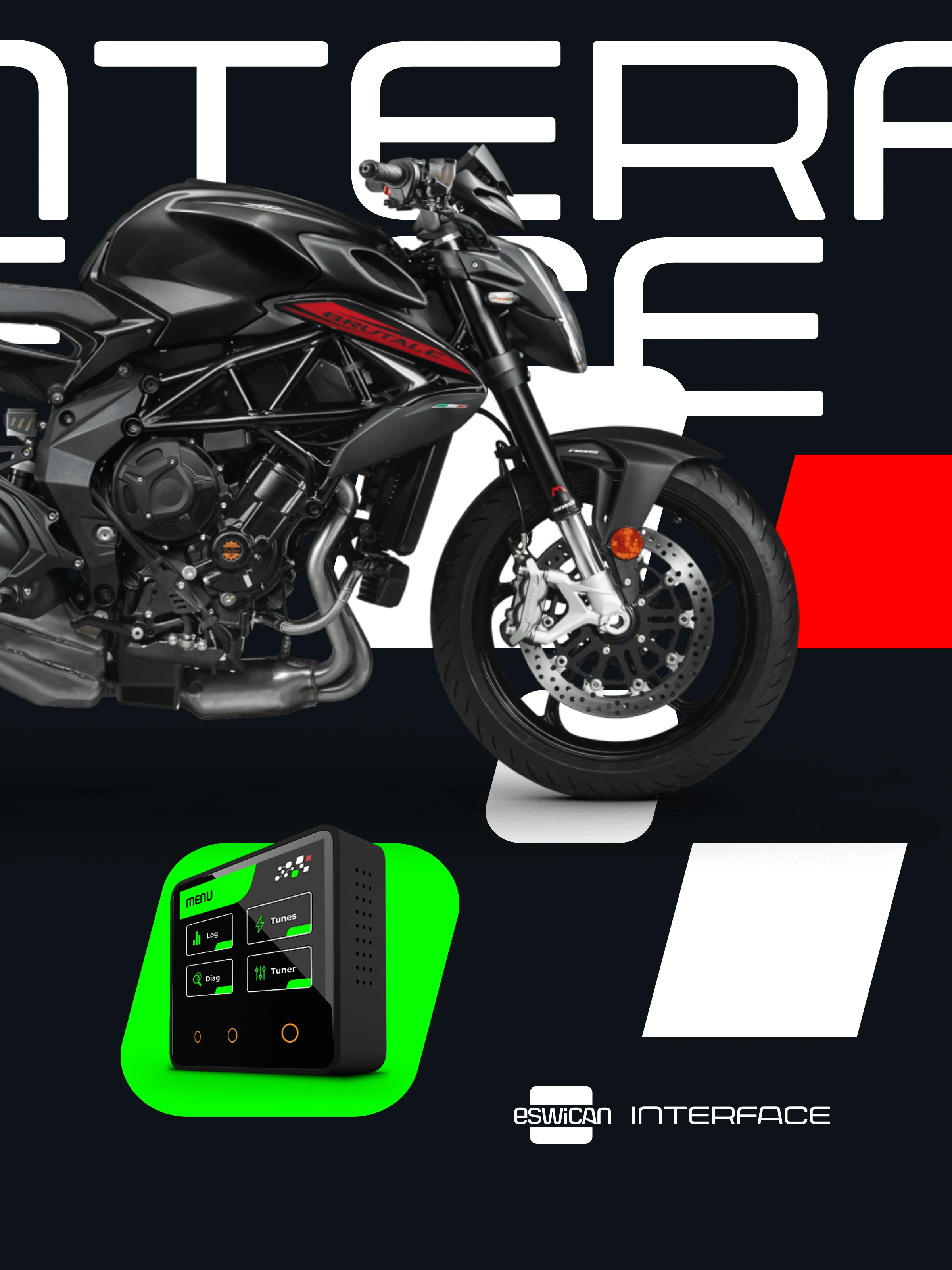
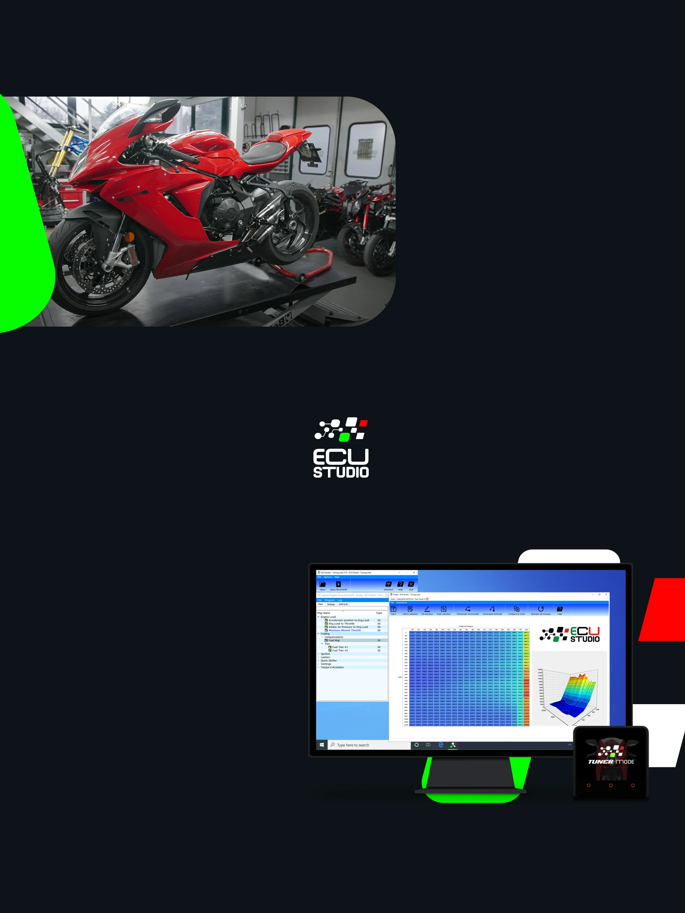
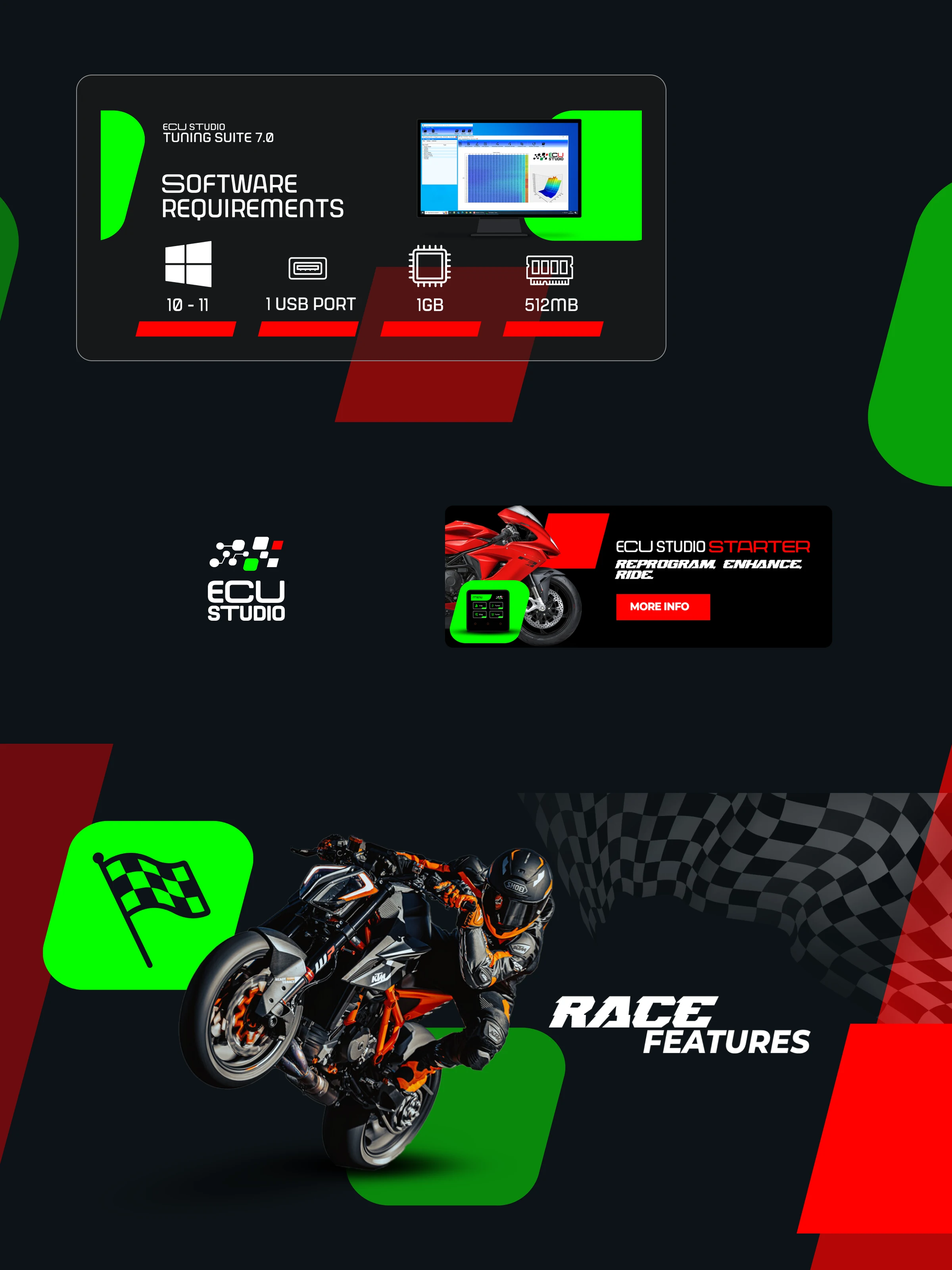
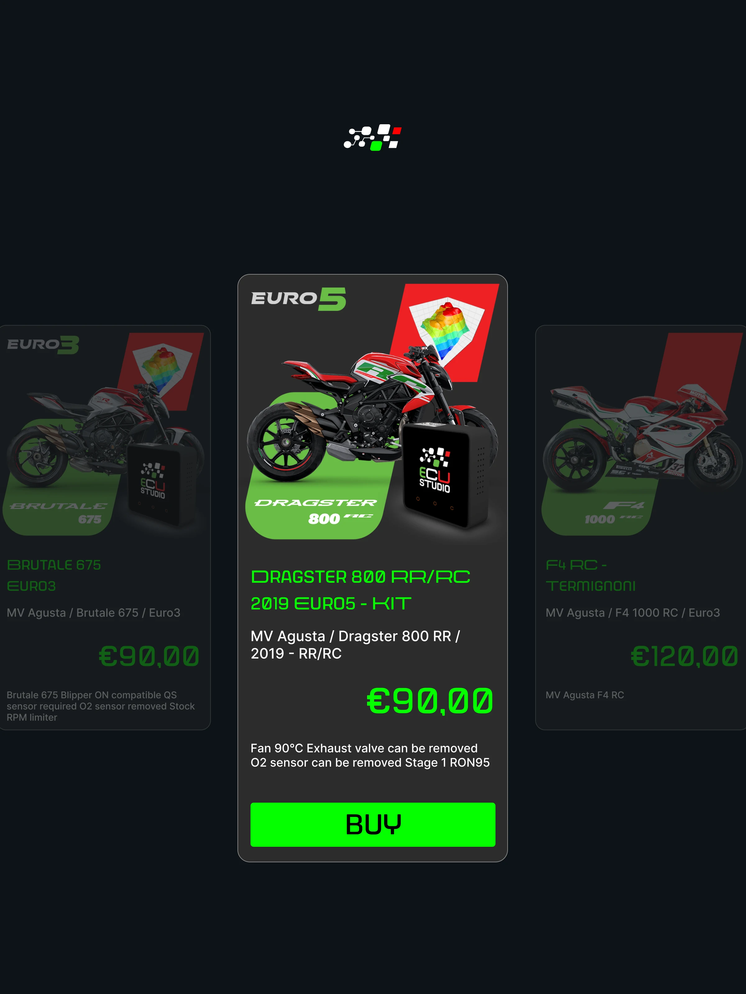
Visual language first — typography, colour and tone calibrated for a professional technical audience — then applied systematically across ESWICAN, TUNING SUITE and PROPLUS, each receiving a product-level treatment that held family coherence while preserving distinction.
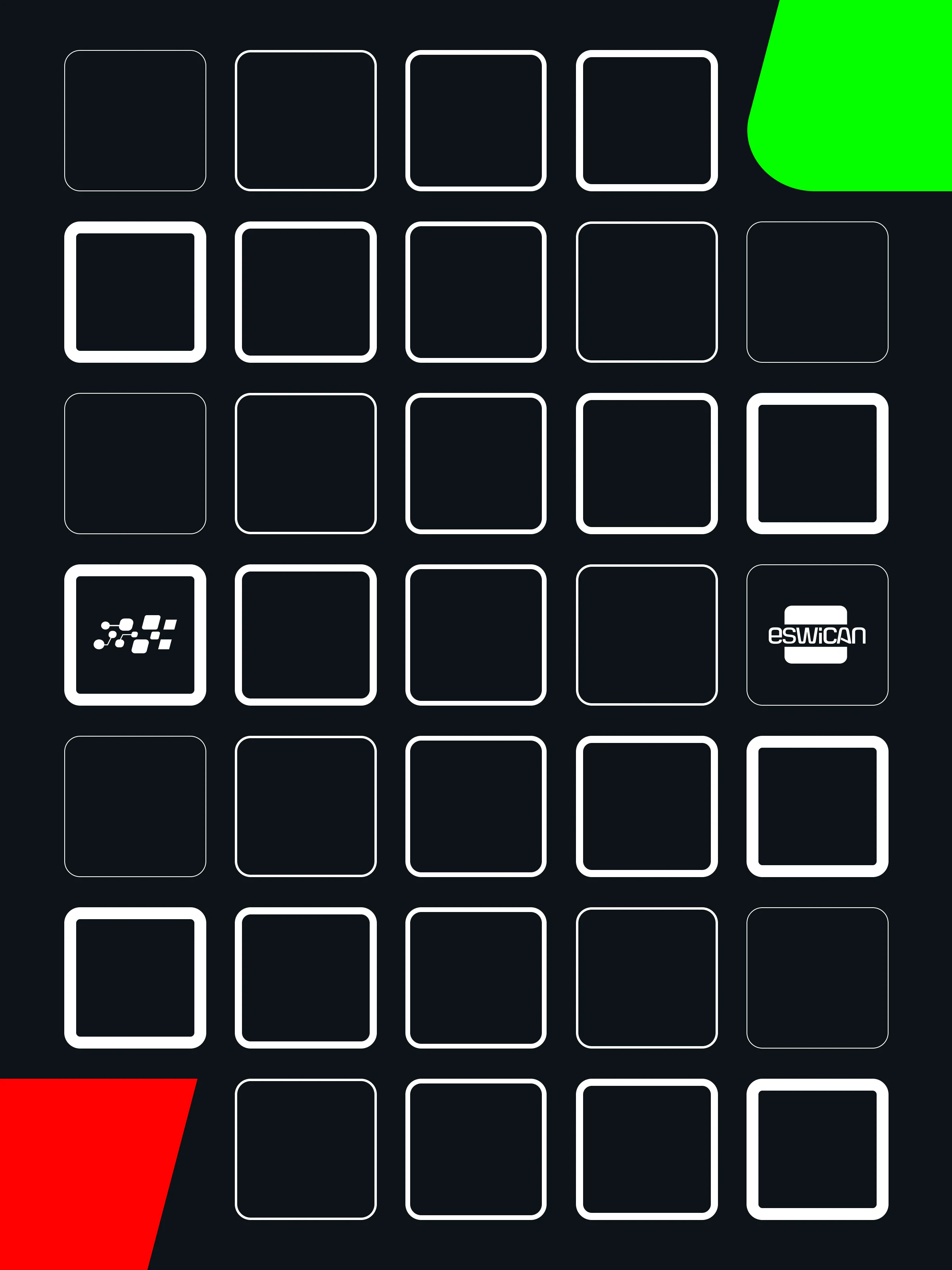
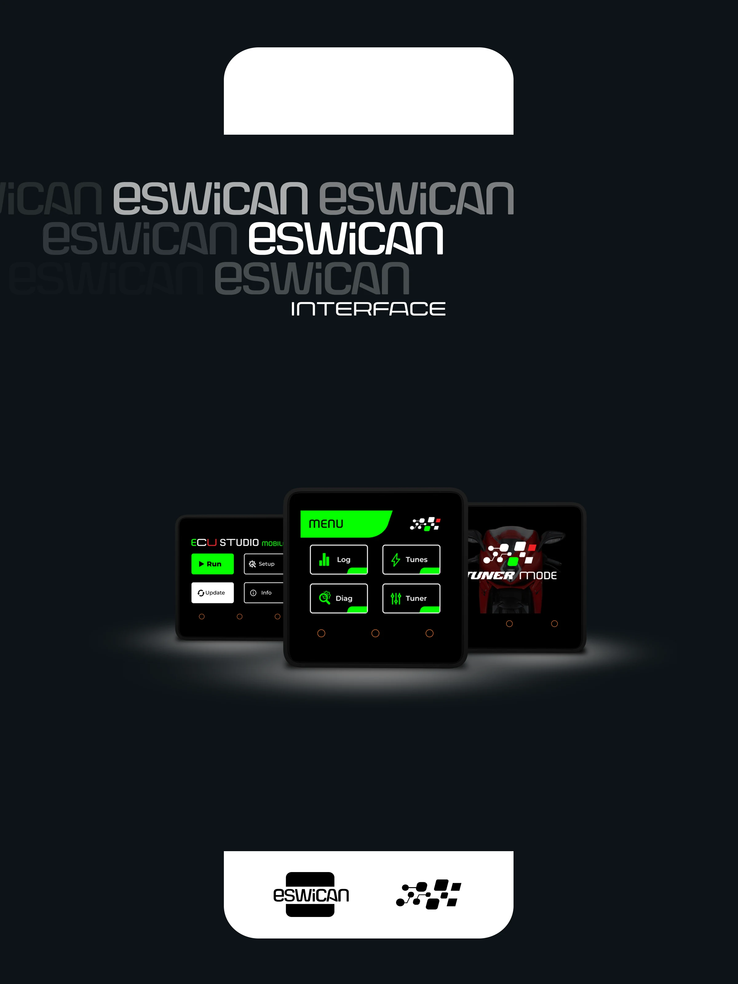
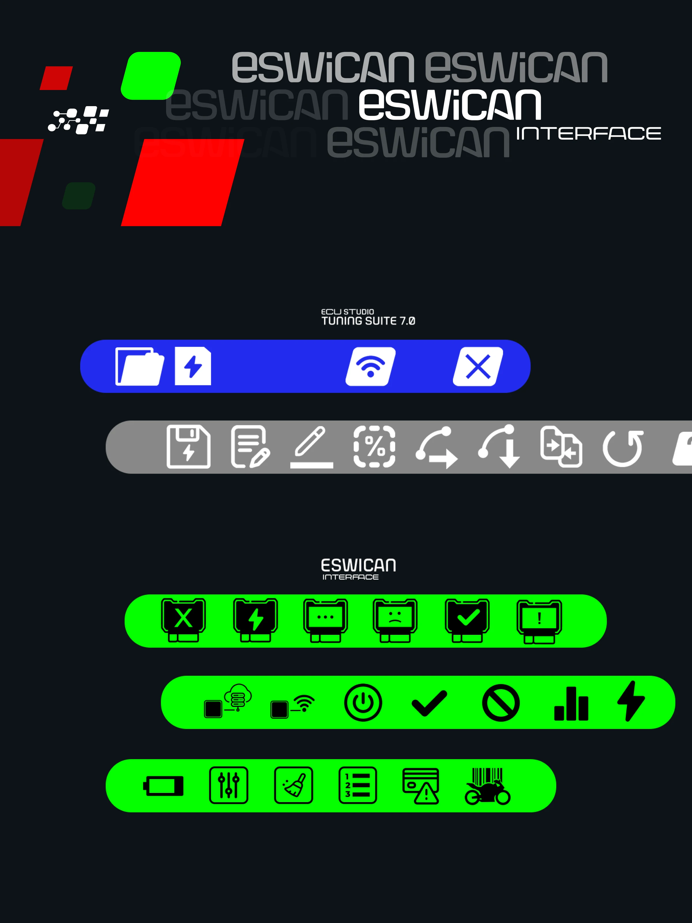
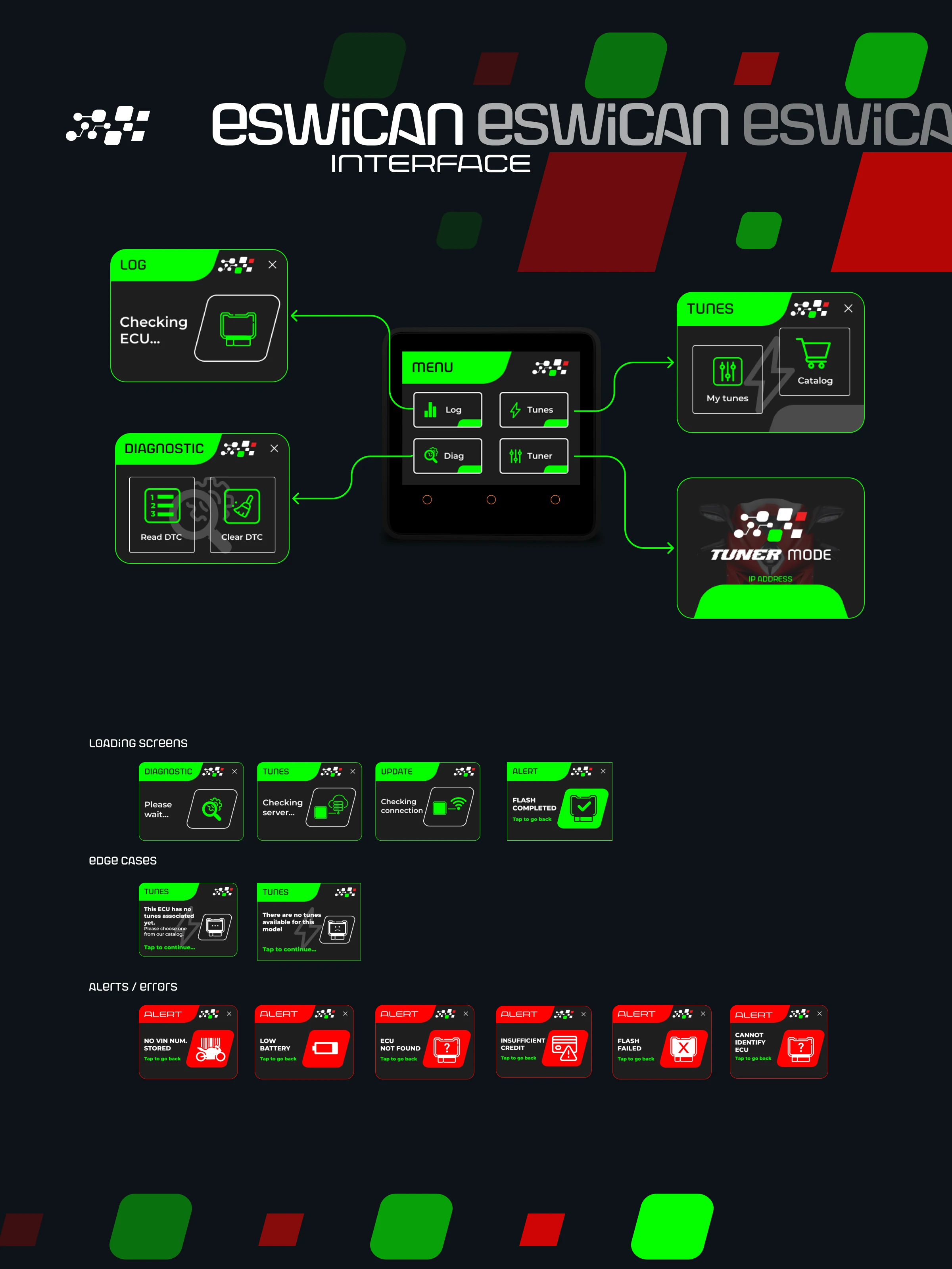
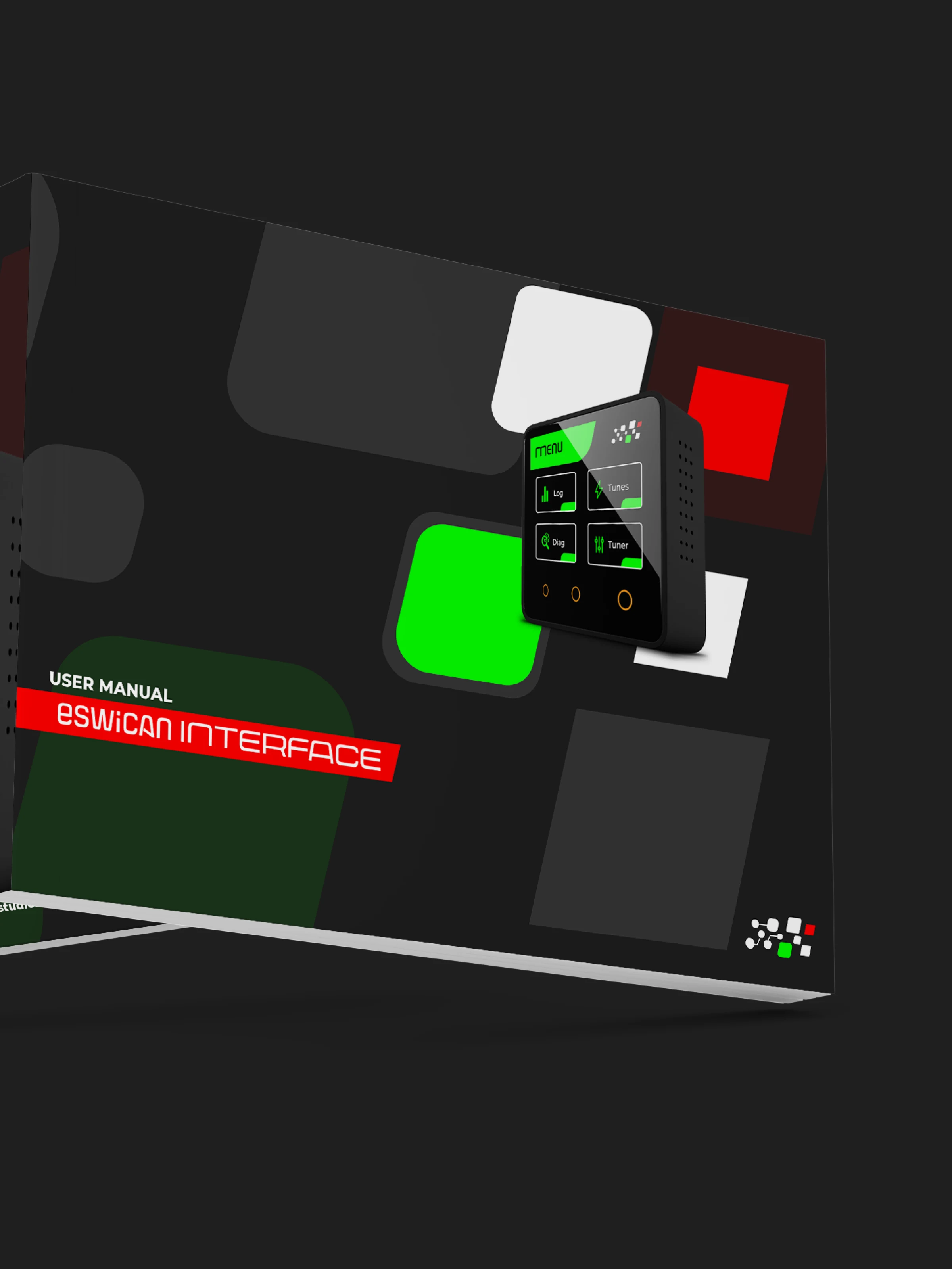
The ESWICAN redesign was the most demanding piece: full UX and UI overhaul around information hierarchy, workflow simplification and navigational clarity, for a context where users make precise, consequential adjustments. A custom iconography system and design system support it.
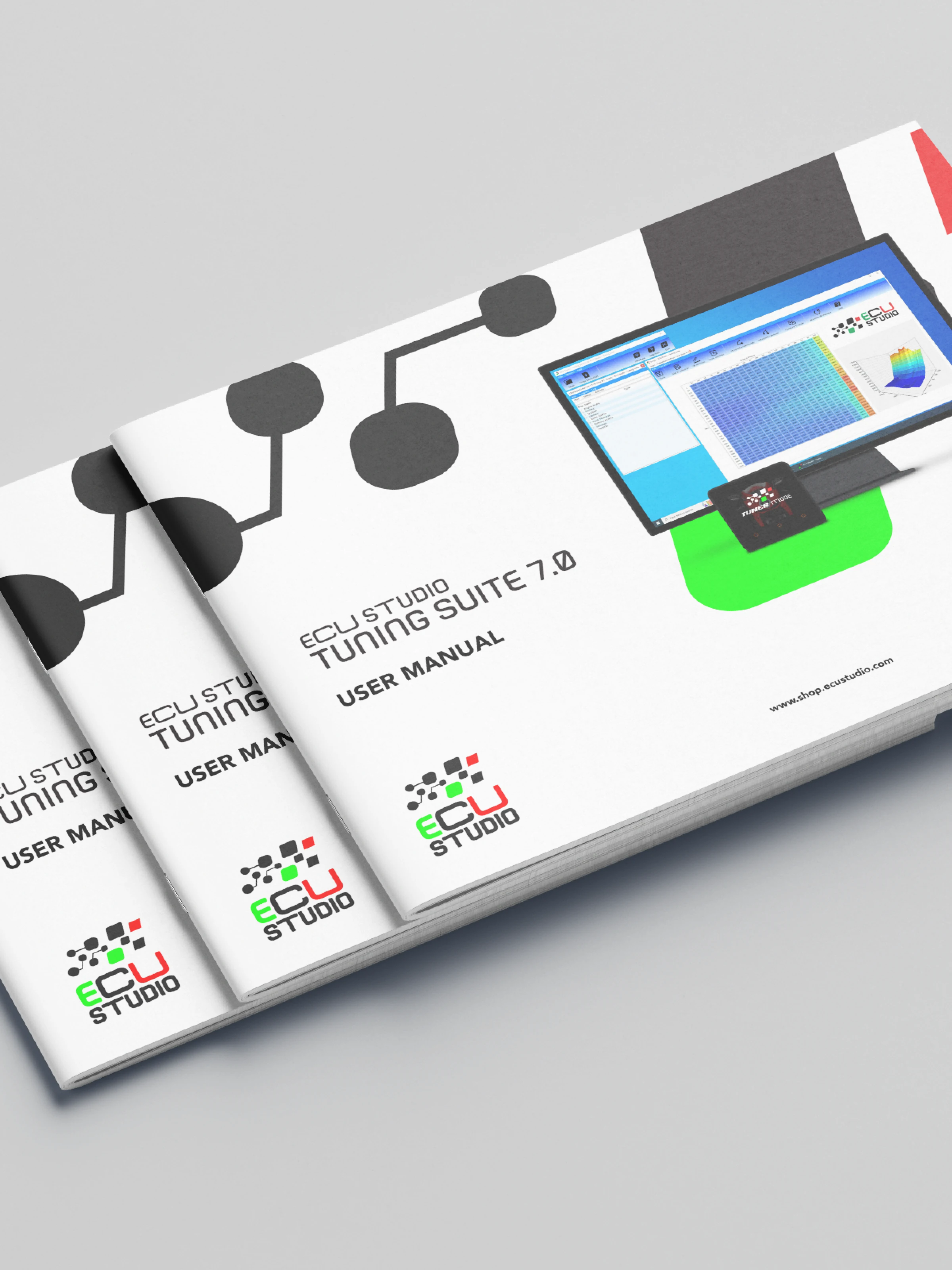
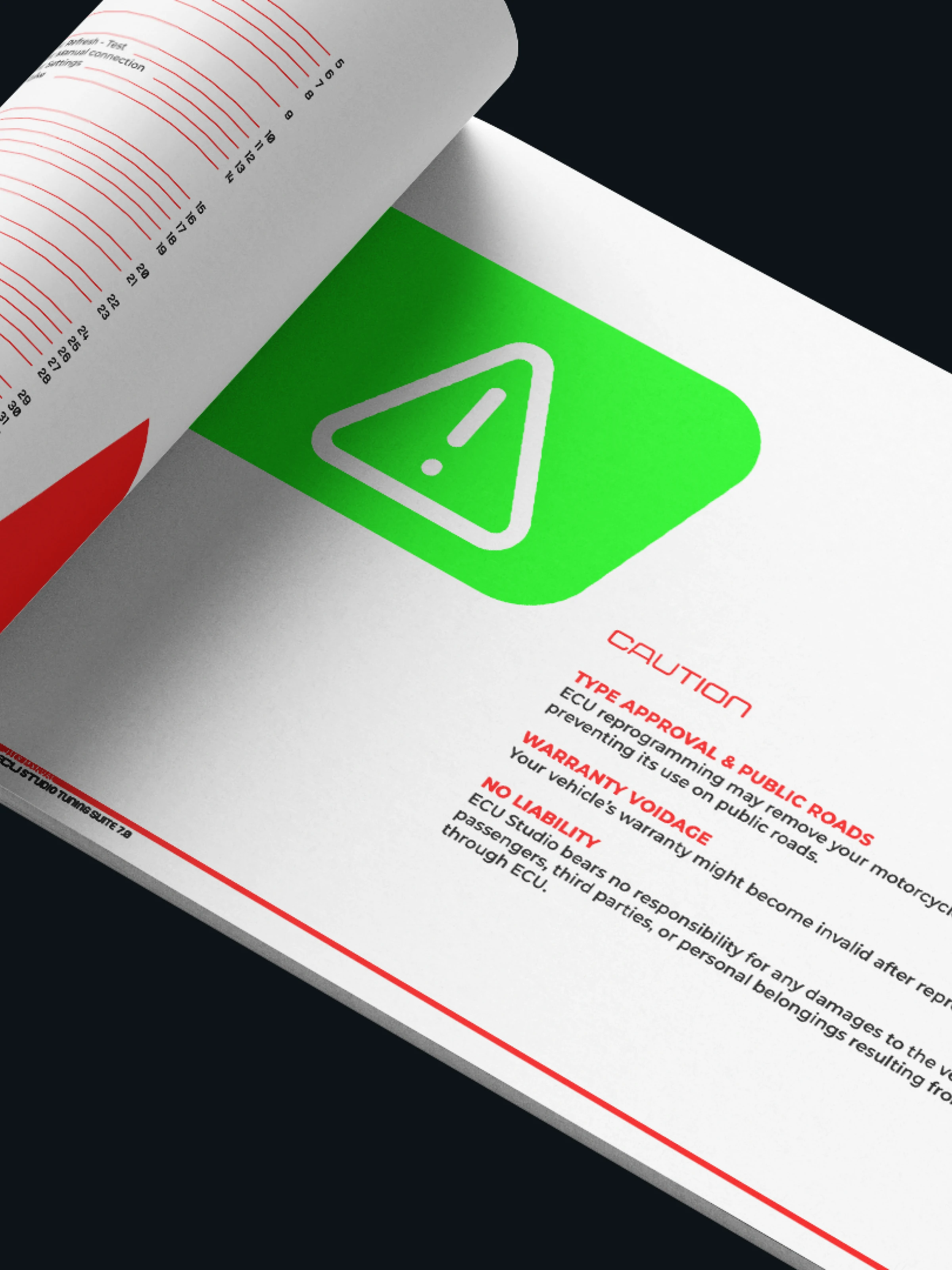
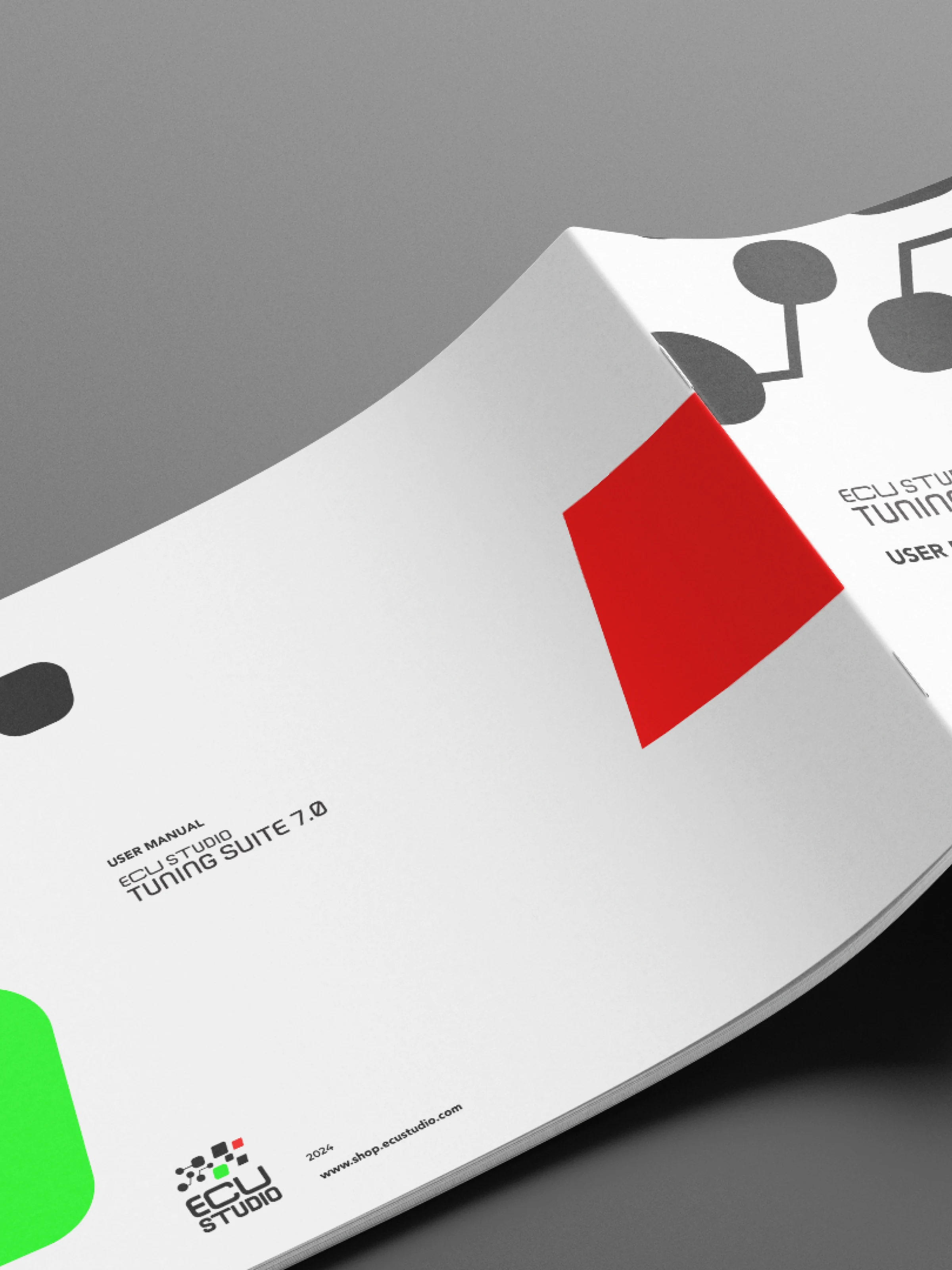
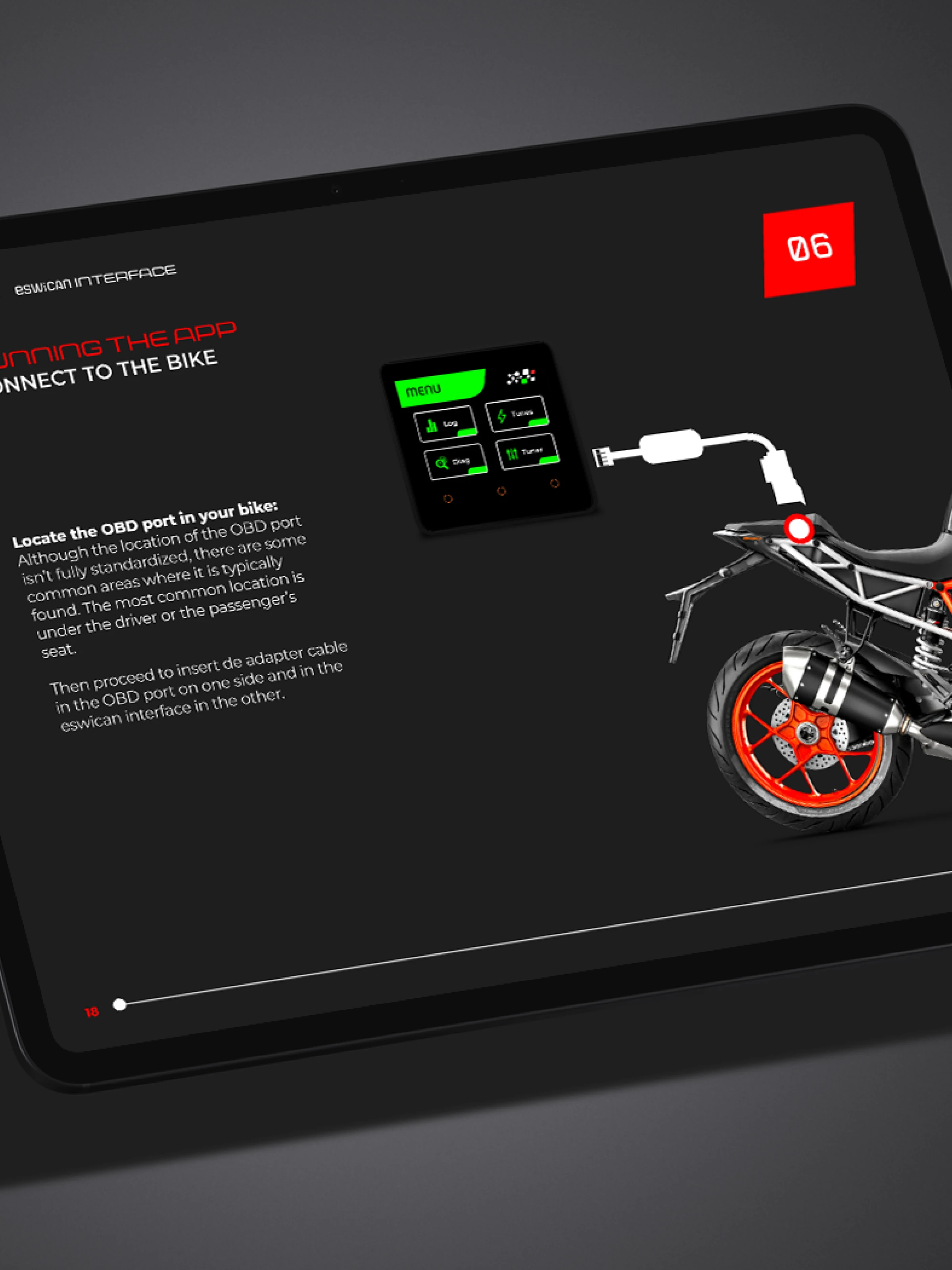
User manuals were the final layer — full technical documentation translating complex processes into structured, visually guided content usable under real working conditions.
Why it stands out
Most case studies are either brand or product. This is brand, product ecosystem, software UX, design systems and technical documentation for one client. From the logo, to the icon at 16px, to the page layout of a 40-page manual.