


What Disney Knew in 1981 That Your App Still Gets Wrong
Twelve principles written for hand-drawn cartoons explain most of what makes interface animation feel right, and most of what makes it feel cheap.
Read ArticleTL;DR
In 1981, two Disney animators wrote down twelve principles that make drawings feel alive. Interface designers have been borrowing them since at least 1993. Three of them (slow in and slow out, anticipation, follow through) do most of the work in a modern app, a fourth (timing) is where most products go wrong, and one thing the animators never had to think about, the viewer’s inner ear, is now part of the job.
A book about cartoons
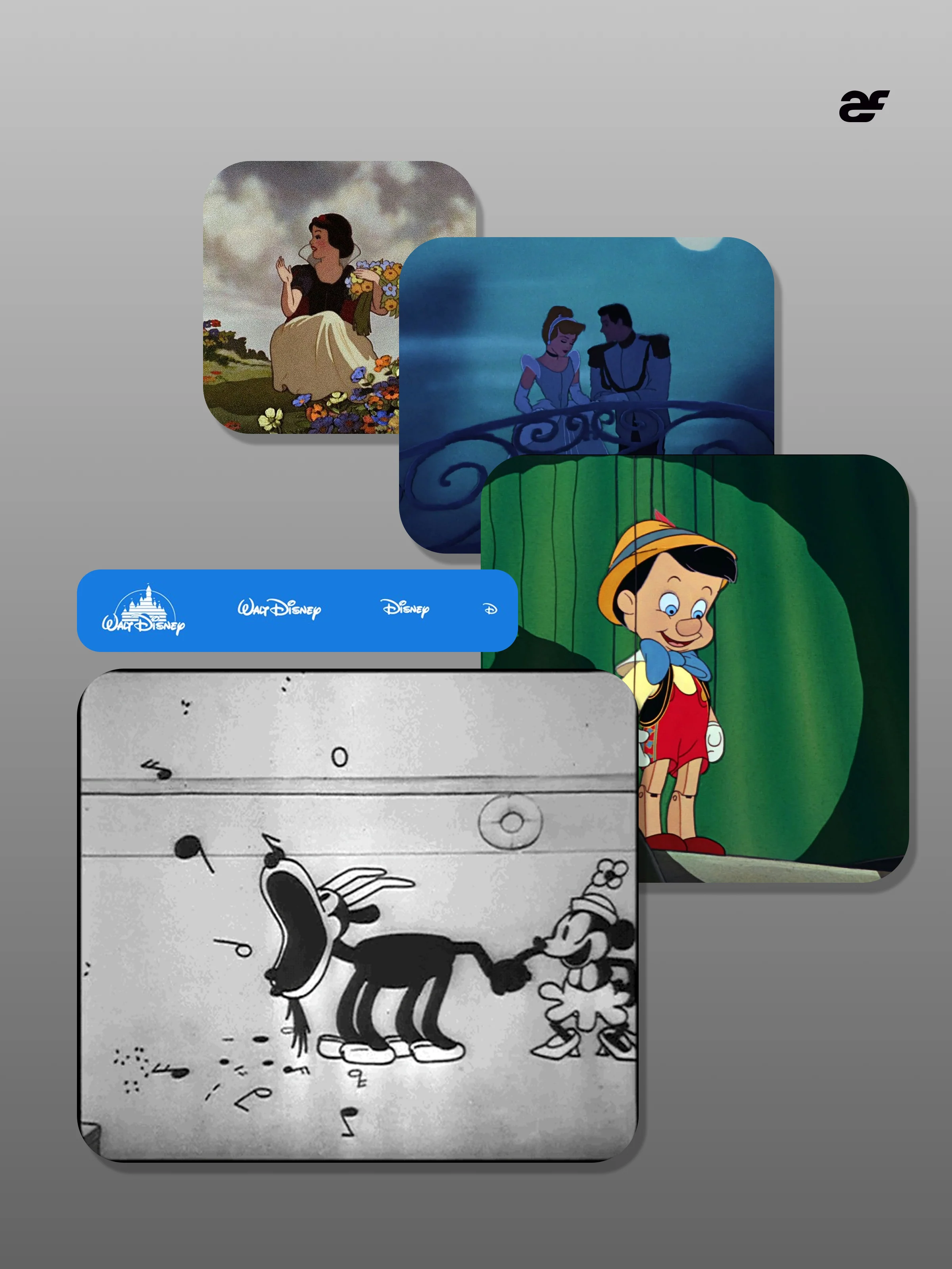
The Illusion of Life: Disney Animation was published in 1981 by Frank Thomas and Ollie Johnston, two of the studio’s “Nine Old Men”, the core animators behind films from Snow White to The Jungle Book. In it they set out twelve principles the studio had arrived at over decades of trial and error: squash and stretch, anticipation, staging, straight ahead action and pose to pose, follow through and overlapping action, slow in and slow out, arcs, secondary action, timing, exaggeration, solid drawing, and appeal.
None of it was written for software. But in 1993 two researchers working on the Self programming environment, Bay-Wei Chang and David Ungar, published a paper called Animation: From Cartoons to the User Interface. Their argument was that the same principles would make interfaces easier to understand, because a window that moves like a physical thing tells you where it came from and where it went. Thirty years later, that paper reads like a description of every phone in your pocket.
The three principles that do most of the work
Slow in and slow out. Nothing in the real world starts or stops instantly. Animators draw more frames near the beginning and end of a movement so it accelerates and settles. In an interface this is easing. It is the single biggest difference between motion that feels designed and motion that feels like a default. The Nielsen Norman Group puts it plainly: linear motion tends to look unnatural next to eased motion. A menu that slides at a constant speed looks like a machine. The same menu that starts fast and settles gently looks like it has weight.
Anticipation. Before a character jumps, it crouches. The crouch tells the audience what is about to happen. The interface version is small: a button that presses down before the screen changes, a card that lifts slightly before you drag it, a pull-to-refresh that stretches before it lets go. These moments last a fraction of a second, and they answer the question every tap raises: did that work?
Follow through and overlapping action. When a character stops, the hair and the coat keep moving for a moment. Parts of a thing do not all arrive at once. In an interface, this is stagger: list items that appear one after another instead of in a block, or a panel that lands a beat before its contents. It gives the eye an order to read in.
Timing is where apps get it wrong
Thomas and Johnston treated timing as the principle that gives a movement its meaning. The same action at different speeds reads as light or heavy, calm or urgent.
A cinema audience has paid to sit and watch. Someone using an app is trying to do something else, and every animation stands between them and it. The Nielsen Norman Group’s guidance is that most interface animations should last between 100 and 500 milliseconds, that simple feedback such as a checkbox or a switch should take around 100, and that it is far more common for animations to be too long than too short. Their advice is to find the shortest duration that isn’t jarring.
That is the most common mistake in products today. The movement is fine. There is just too much of it, for too long, on things people do fifty times a day. An animation that delights on the first visit is a tax by the tenth.
What Disney never had to think about
A film plays the same way for everyone in the room. An interface moves in response to one person’s hands, on a screen close to their face.
When Apple released iOS 7 in September 2013, with its zooming transitions and a home screen that shifted as you tilted the phone, some users reported dizziness and nausea. A month later, iOS 7.0.3 extended the Reduce Motion setting so that it replaced the zooms with simple cross-fades.
That setting is now everywhere. Operating systems expose it, browsers pass it on to websites through the prefers-reduced-motion media query, and the Web Content Accessibility Guidelines include a criterion (2.3.3, Animation from Interactions) asking that motion triggered by interaction can be switched off unless it is essential. Good motion design has a still version that works just as well.
A short checklist
- Does the movement explain something? Where a thing came from, where it went, or that a tap was received. If it explains nothing, it is decoration, and decoration should be rare.
- Is it eased? Anything that moves in a straight line at constant speed needs a reason.
- Could it be shorter? Try half the duration. If nothing is lost, keep the shorter one.
- Does it happen fifty times a day? Then it should be nearly invisible.
- What happens with Reduce Motion on? There should be an answer, and it should be designed.
Disney’s animators were trying to make an audience believe that drawings were alive. An interface has a smaller job: to make a person feel that the thing under their thumb is solid, and that it heard them. The principles are the same. The difference is knowing when to stop.
Sources
- Frank Thomas and Ollie Johnston, The Illusion of Life: Disney Animation (1981)
- Bay-Wei Chang and David Ungar, Animation: From Cartoons to the User Interface (UIST, 1993)
- Nielsen Norman Group, Executing UX Animations: Duration and Motion Characteristics
- Daring Fireball, Apple Releases iOS 7.0.3 With Updated Reduce Motion Setting (October 2013)
- W3C, Understanding Success Criterion 2.3.3: Animation from Interactions