Feeds+: Separating Inspiration from Everyday Life on Instagram
An academic UX/UI case study; how Team Marvel explored four concepts, scored them against a PRD, and designed custom feeds that let creatives keep one Instagram account but switch context in a single tap.
Read ArticleTL;DR
Creative professionals use Instagram for two very different things: finding professional inspiration and keeping up with their personal lives. Instagram gives them a single feed that mixes both. Over a short academic sprint, Team Marvel explored four concepts for fixing this, scored each one against the product requirements on a 40-point rubric, and took the winner, Feeds+, into high-fidelity flows for mobile, desktop and tablet.
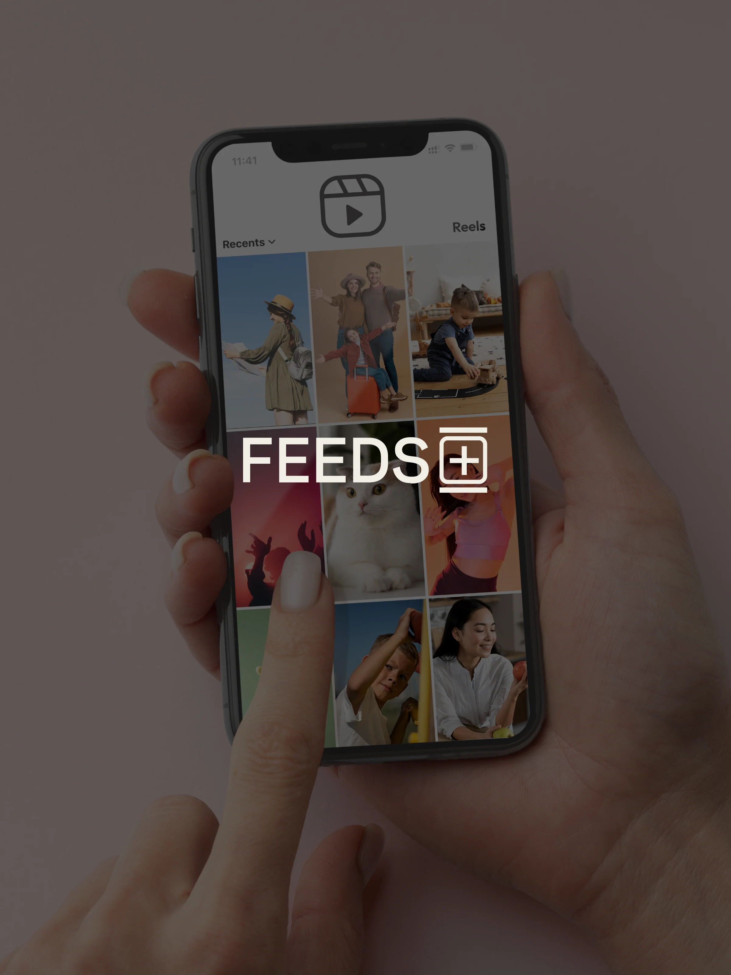
Feeds+ lets users create named custom feeds, built from the hashtags and captions they care about, and switch between them from the header in a single tap. It keeps one account and one identity, but shows different content depending on what the user is there for.
If you work in a creative field, your Instagram feed probably looks a lot like ours did: a studio's latest branding project, then a friend's holiday photos, then a typography reference you want to save, then a meme. Instagram is where a lot of us go for professional inspiration, and it's also where we go to switch off. The trouble is that it serves both in the same feed, in an order we don't control.
That was the starting point for Feeds+, an academic project I worked on with Eloy Rivas and Nuria Pérez as Team Marvel. The brief was to improve how content is organised on Instagram, and we focused on creative professionals, for whom the problem is especially sharp. Looking for references means filtering out personal posts, and trying to relax means work keeps creeping back in. The usual workaround is a second account, but that splits your identity in two and makes notifications and comments harder to keep track of. So the question we set ourselves was: how might we let creatives keep one identity, but see the right content for the moment they're in?
We didn't want to commit to the first idea, so we explored four. Focus was a double-tap that turned on a distraction-free mode. Switch was a separate space inside the app, filtered by hashtags. The other two were variations of an idea we called Feeds+: custom feeds you build yourself, one version tucked inside a dropdown and the other with a quick-switch button in the header. To choose between them without relying on gut feeling, we scored each concept against our product requirements on a 40-point rubric. Focus scored 24, because it never really separated work from personal content. Switch scored 28: it was the most original idea, but it was hidden and too risky for a first version. The dropdown version of Feeds+ scored 31, and the quick-switch version came out on top with 35.
The final design is simple on purpose. You create named feeds, such as Inspiration, Design or Friends, each built from up to ten hashtags or captions, and you switch between them from the header, where "For you" already lives. Creating a feed takes four taps: open the menu, choose New feed, give it a name and some captions, and it's ready. We spent just as much time on the less glamorous parts: a Feeds manager for reordering and editing feeds, a confirmation before anything is deleted, clear guidance when you hit the feed limit, and small toasts confirming every change. We also carried the pattern over to desktop and tablet and kept the switcher in the same place on every screen, so the habit carries over between devices.
Feeds+ met every success target we set for the project (25% adoption, 60% active use and half as much switching between accounts), with the caveat that, as an academic concept, these were targets rather than live data. More importantly, it solved the problem we started with: one account, many contexts, and nothing new to learn.
The biggest lesson for us was technical. The prototype relied on Figma variables, which we had to learn from scratch in less than a week. It was the hardest part of the project, and it's what made the prototype feel real. The other lesson was about process: scoring our ideas against the requirements kept us honest and stopped us from simply picking the most novel one. If we took Feeds+ further, the next step would be testing the quick-switch with working creatives and exploring ideas we left out of the first version, such as AI-curated and shared feeds.
Feeds+ is an independent academic concept by Team Marvel and is not affiliated with or endorsed by Meta.
Credits
Feeds+ was designed by Team Marvel:
- Eloy Rivas
- Nuria Pérez
- and me
Instagram is a trademark of Meta. Feeds+ is an independent academic concept and is not affiliated with or endorsed by Meta.